


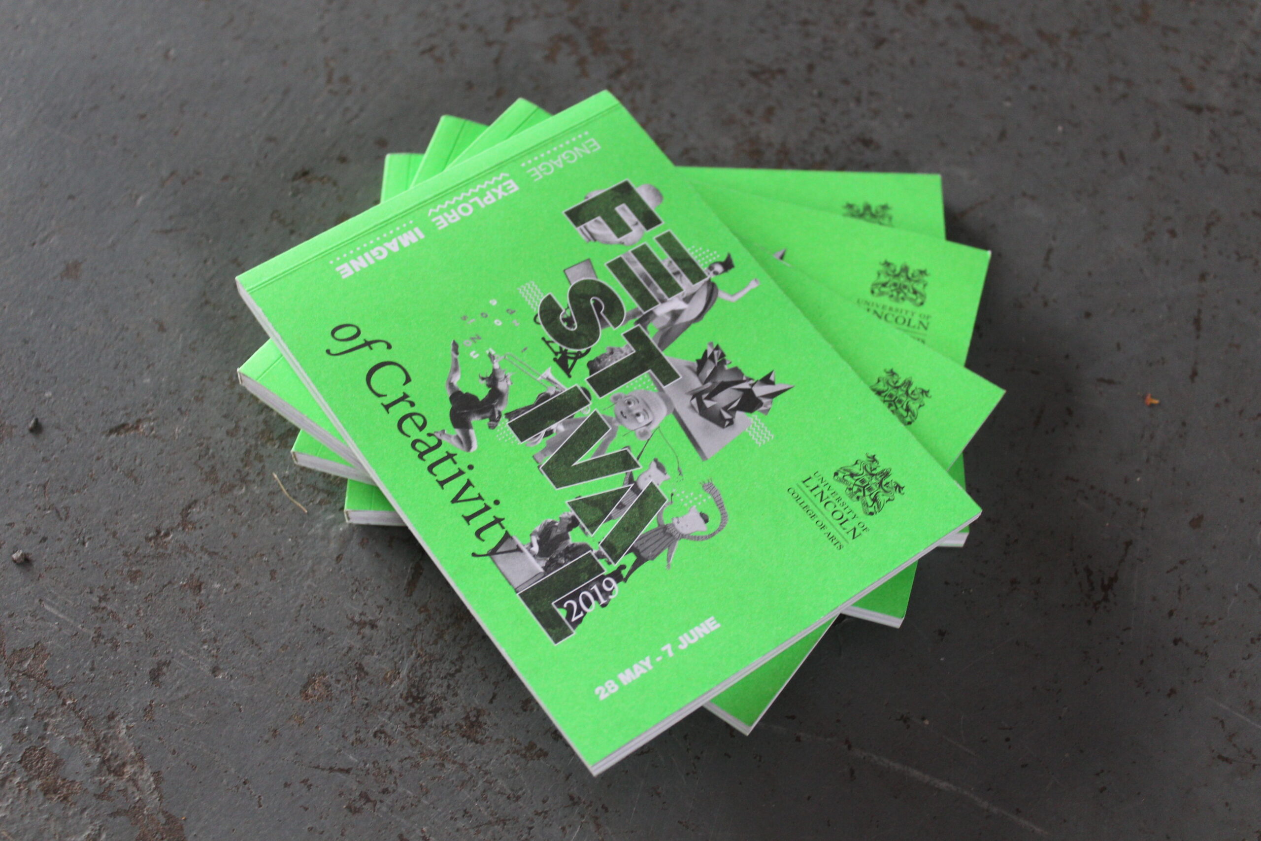
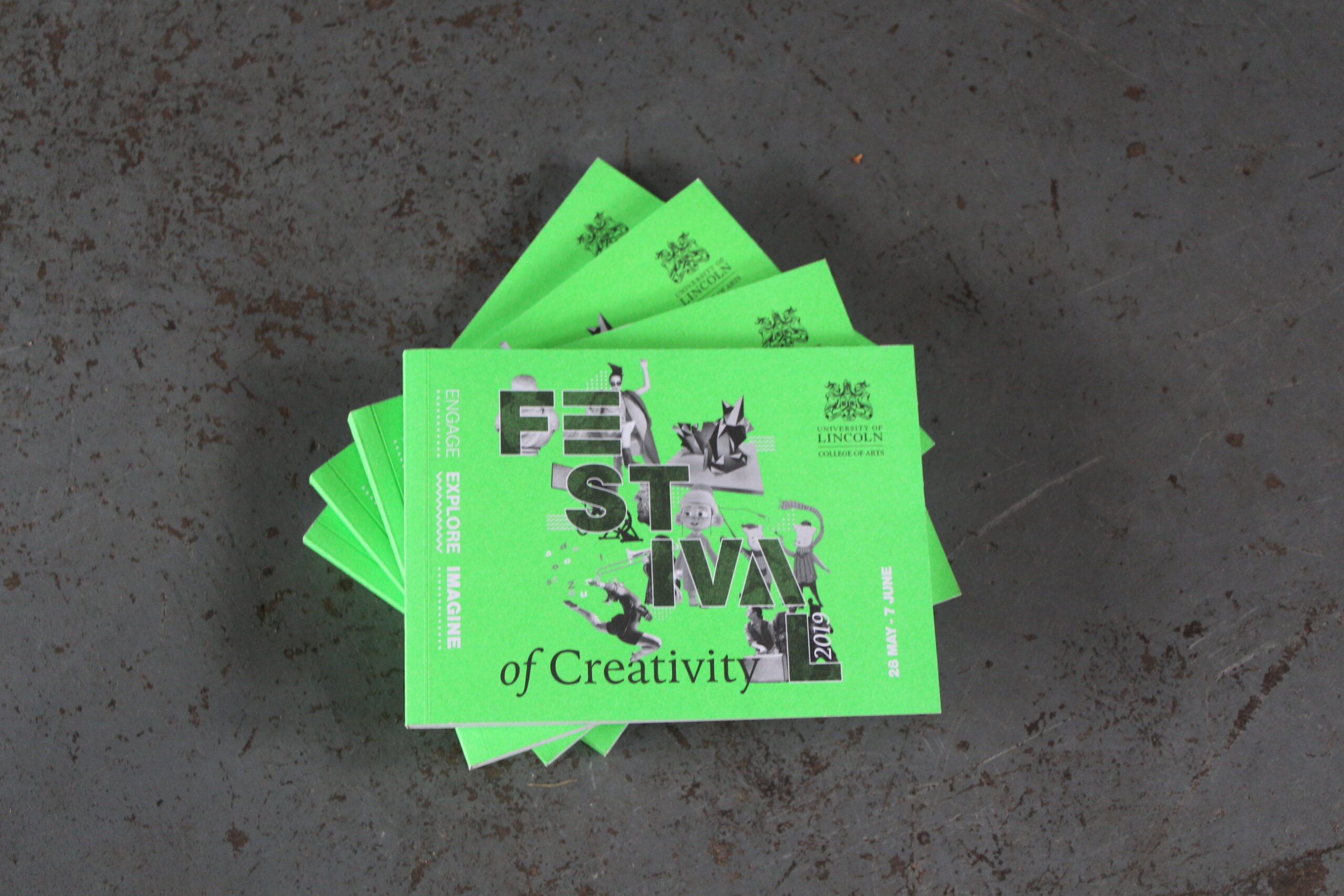
Festival of Creativity 2019
For the third year in a row, Born Agency were commissioned by the University of Lincoln to create marketing collateral for their annual education event. This consisted of an itinerary booklet, a fresh website and posters.
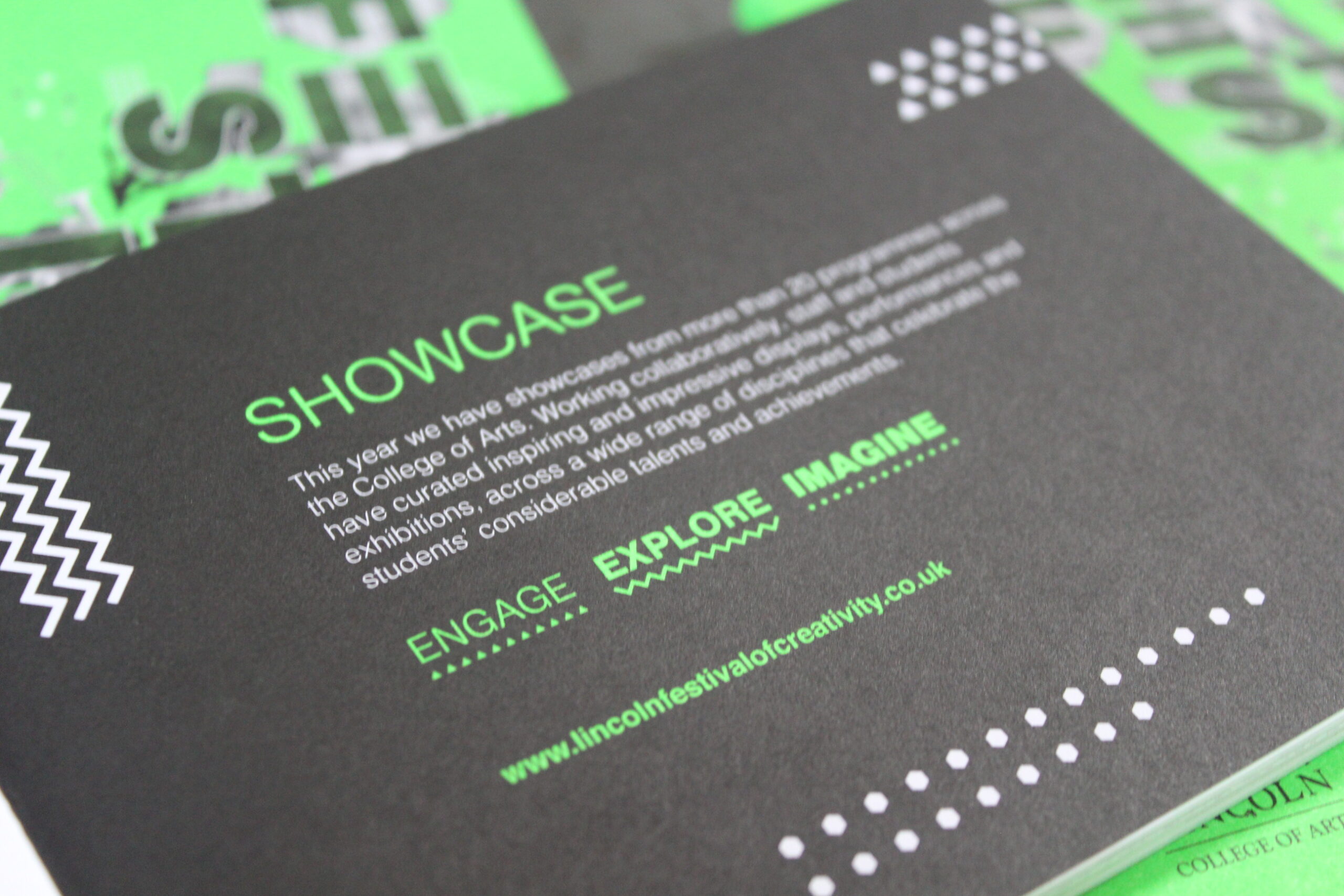
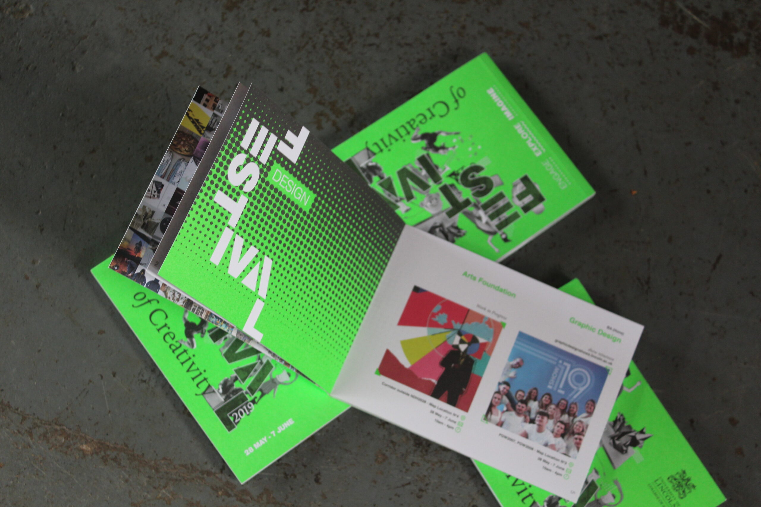
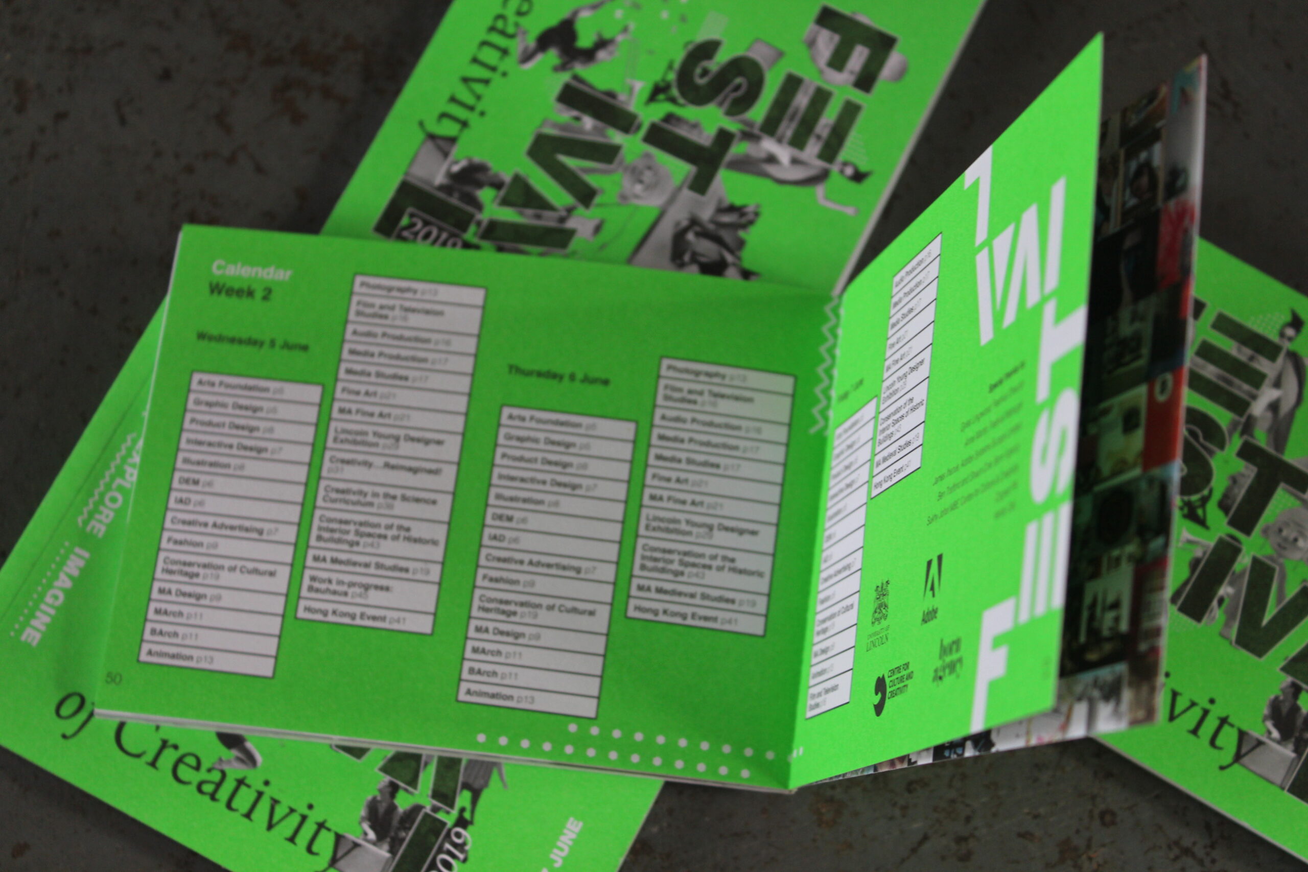
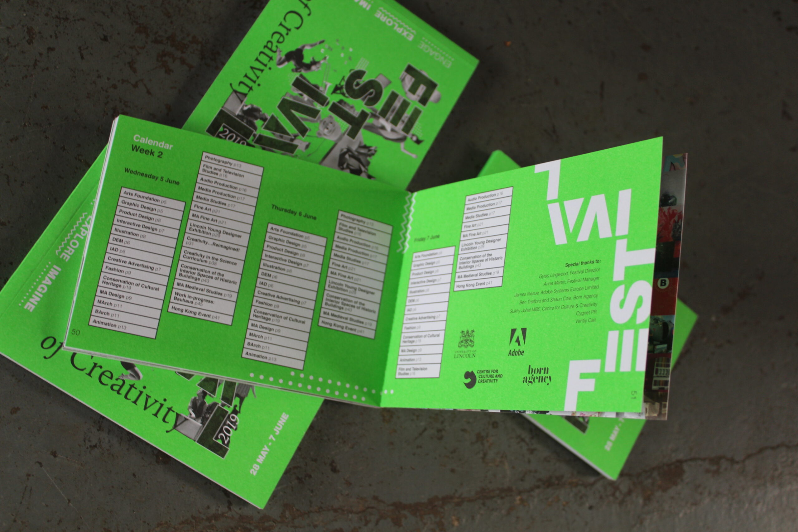
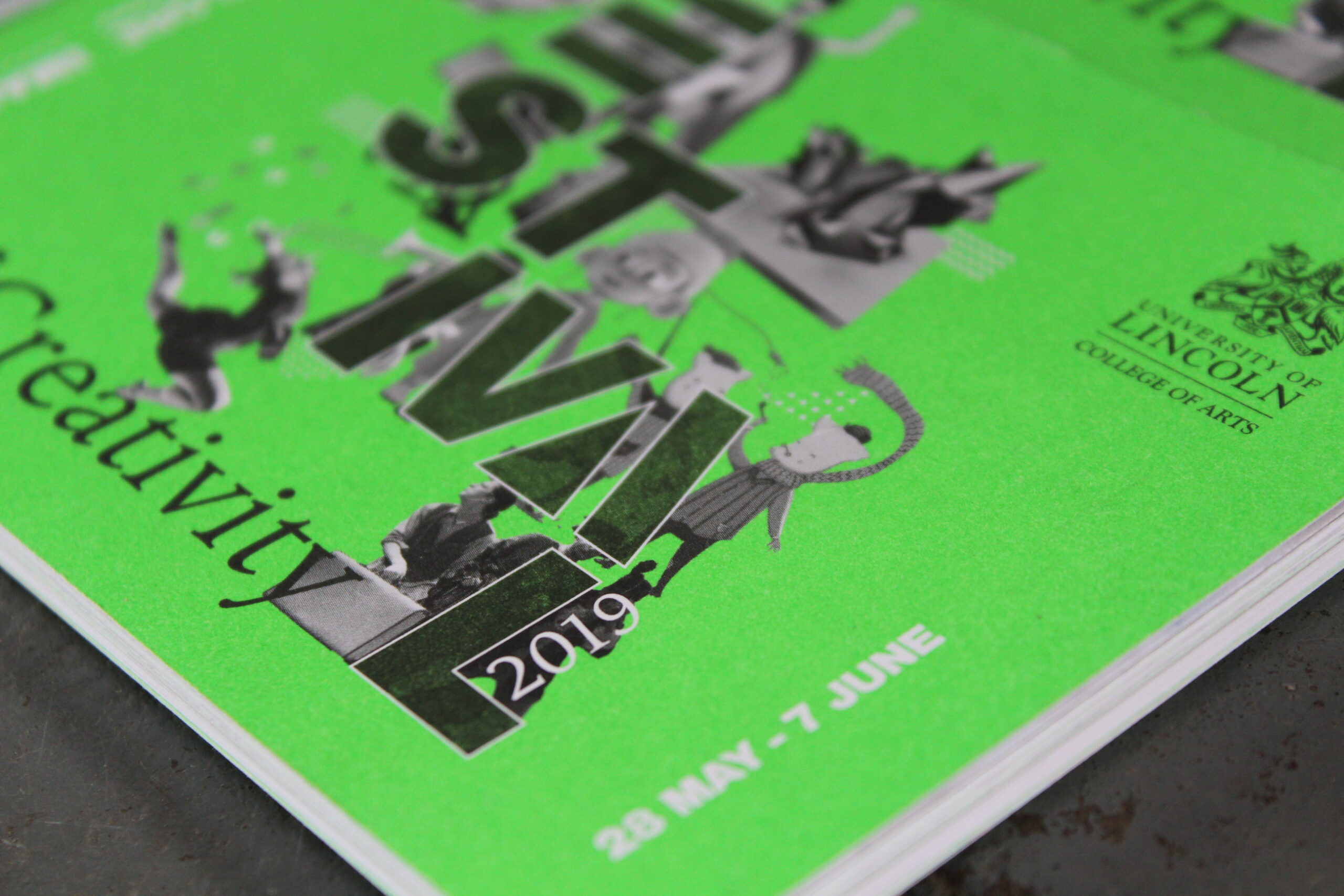
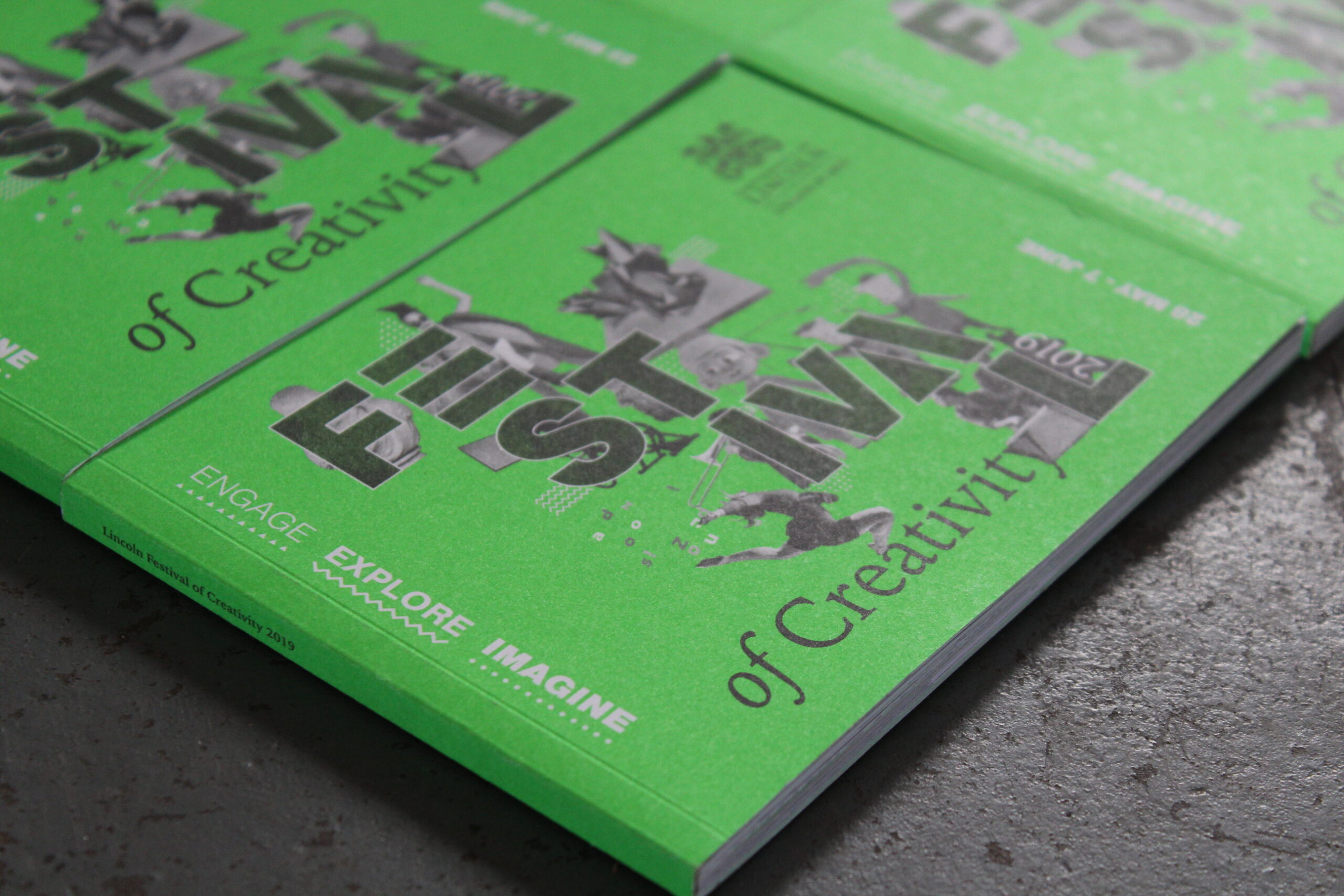
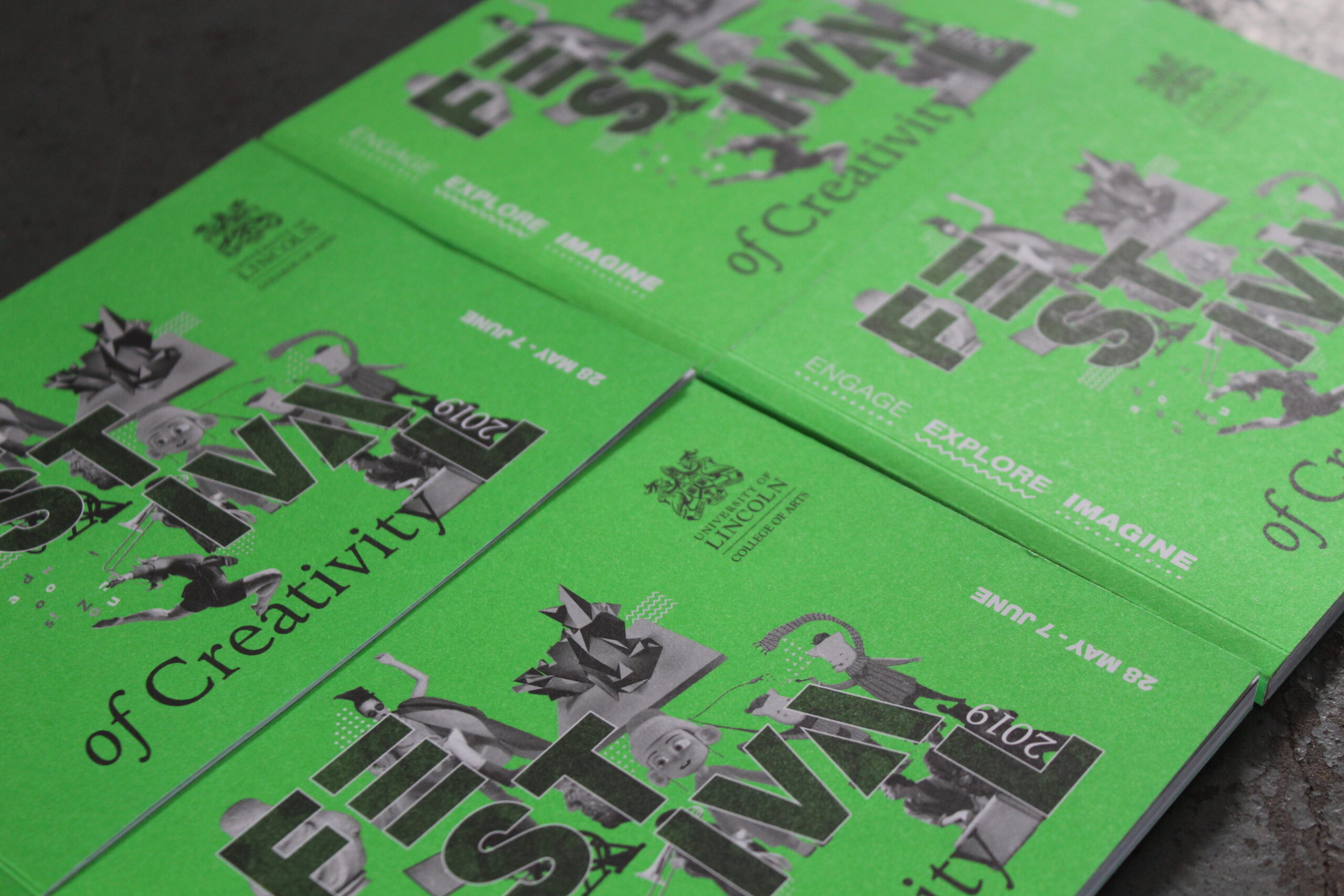
In order to keep consistency with previous years, but also allow the event to have it’s own look we opted for a neon green colour palette, making the marketing material stand out for all the right reasons.
•
Concept
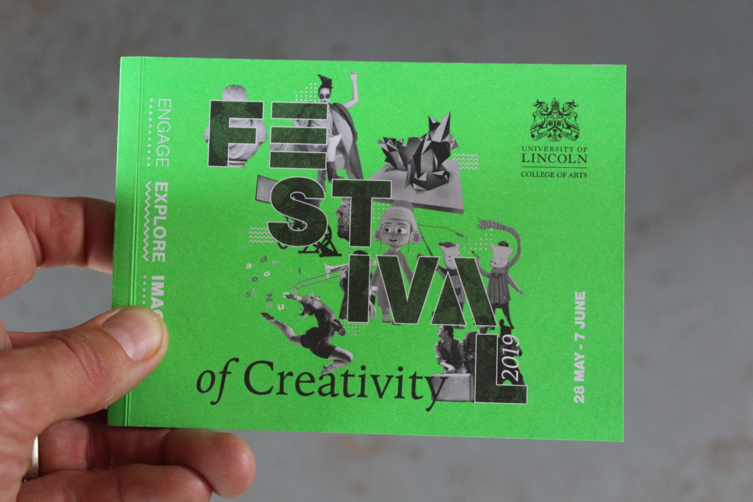
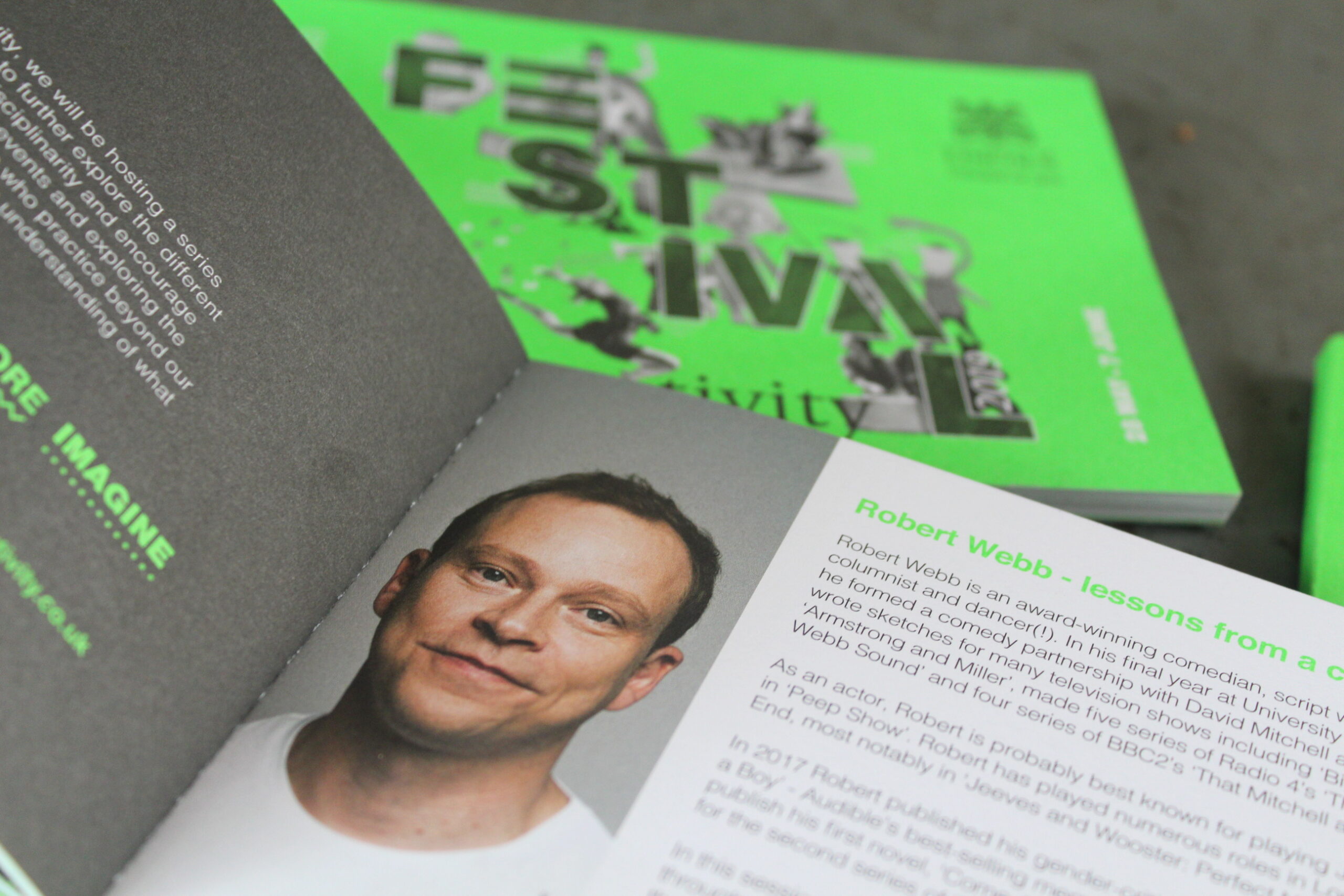
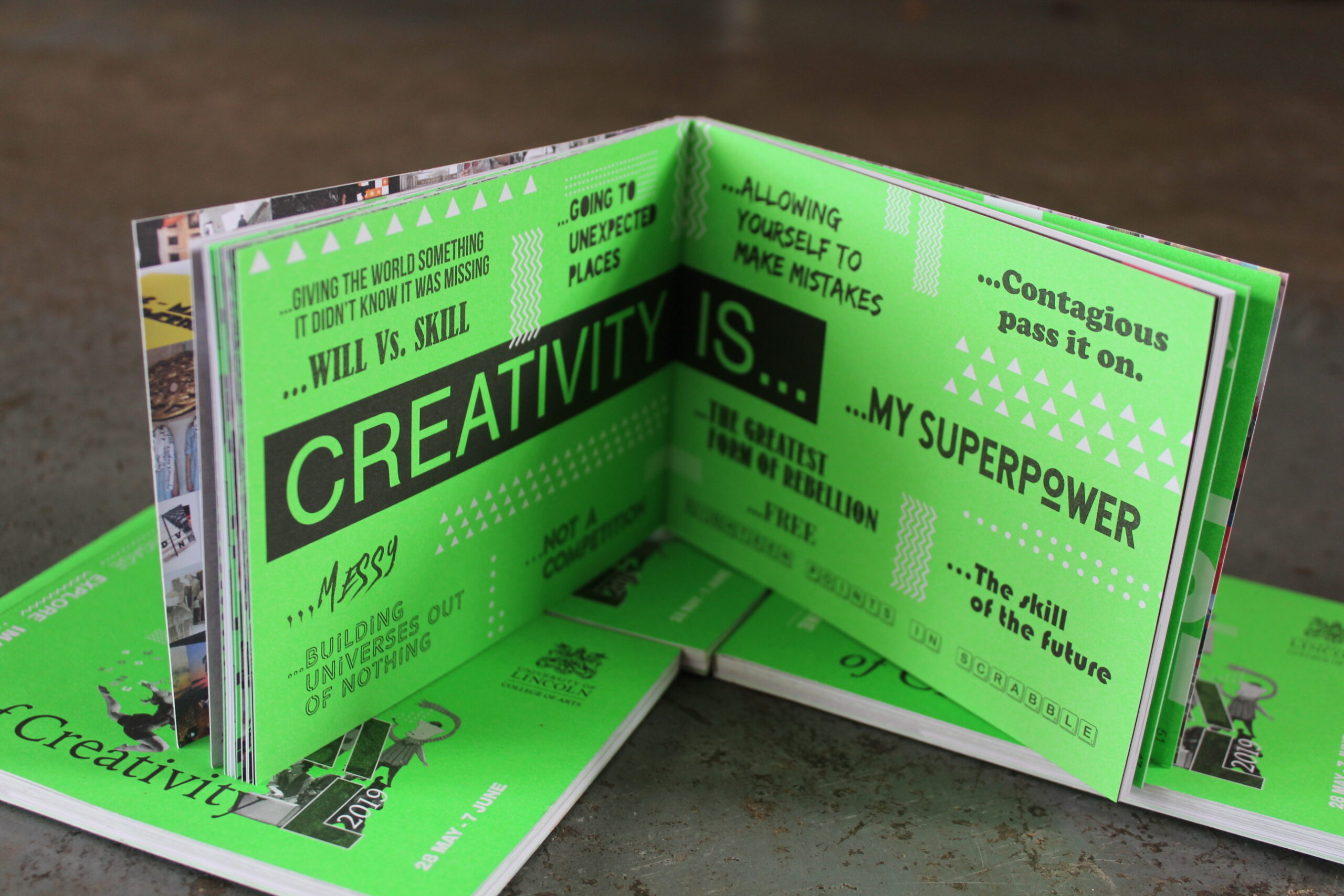
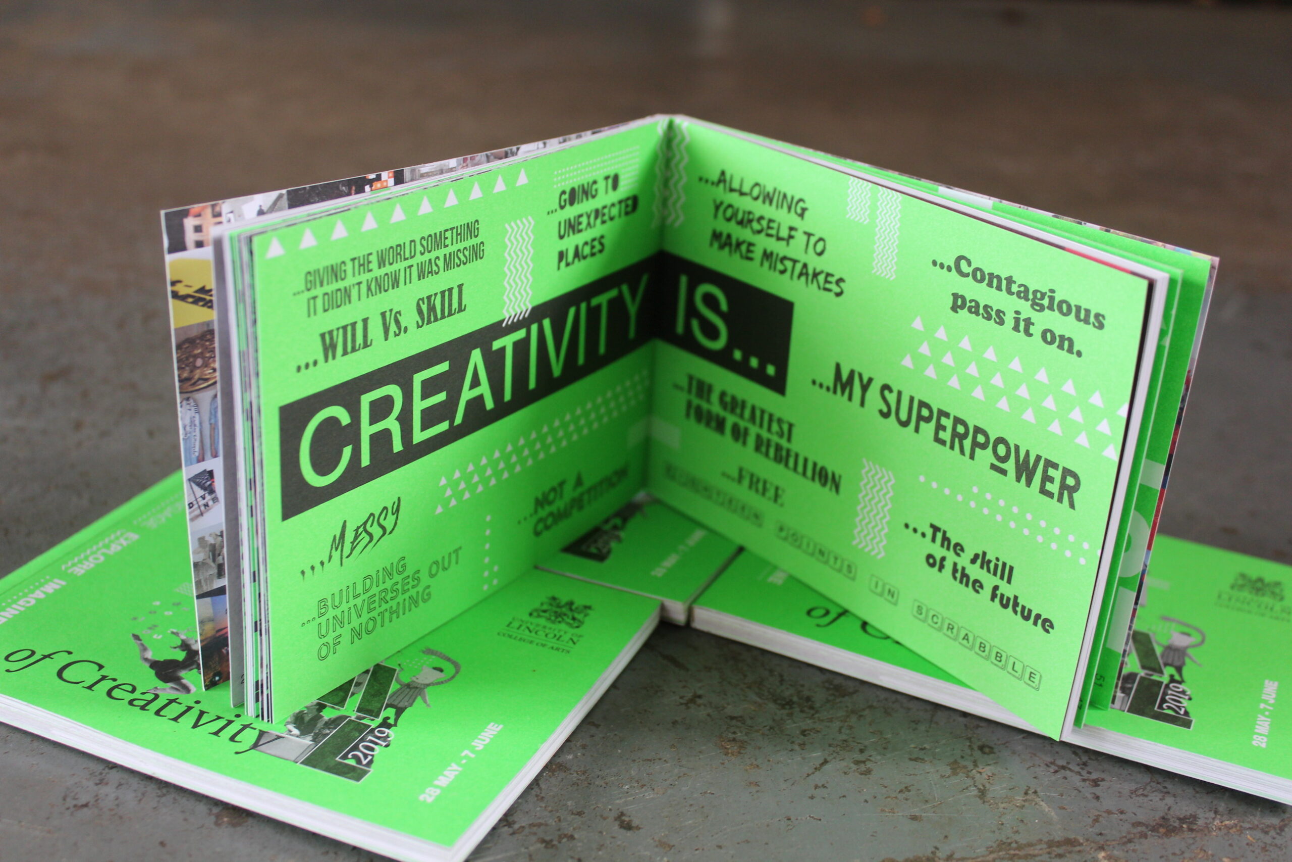
Creativity in colour
The neon colour palette of previous years proved a hit, and we wanted to continue this theme. However this time vouching for a neon green colour palette to gain it’s own unique identity.

•
Branding
The ever changing brand
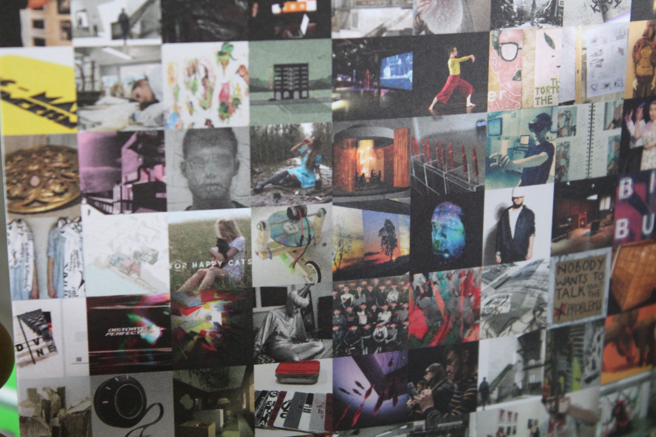
The Festival of Creativity logo had been designed in such a way, allowing it to flex and contract giving us maximum flexibility when designing. This again kept the campaign fresh and exciting. This flexible style was continued through the headers of the website and brochure, always tying back to the now established brand identity.
•
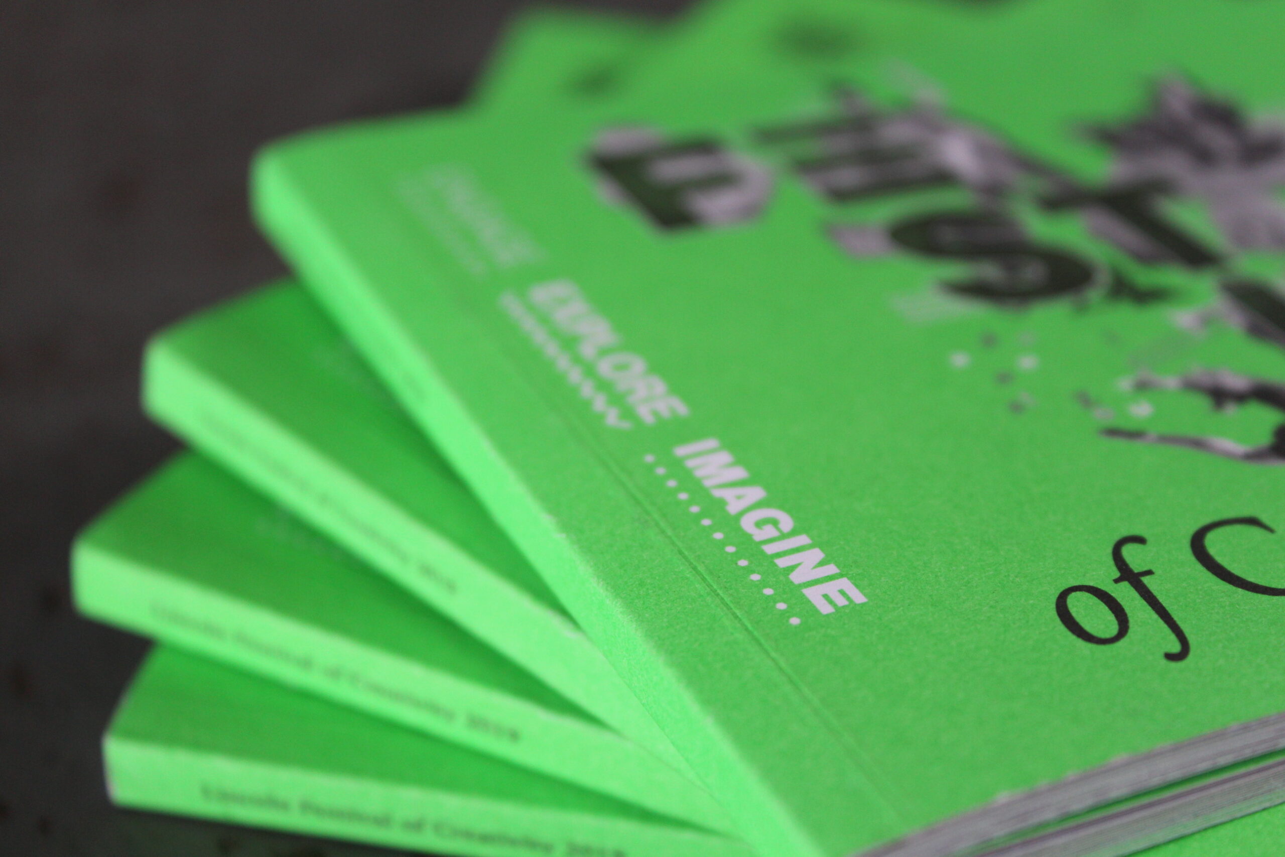
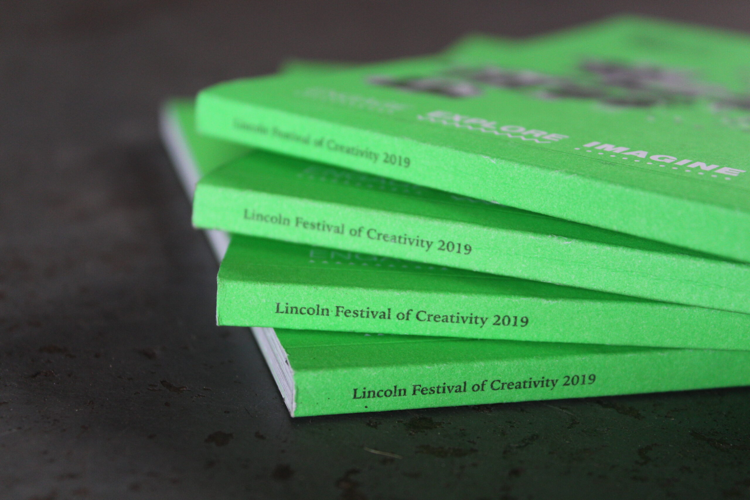
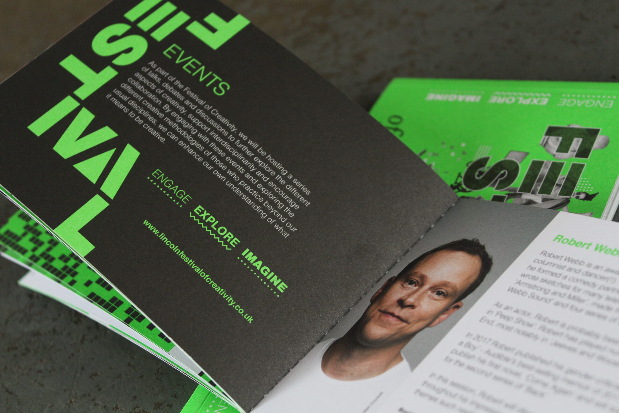
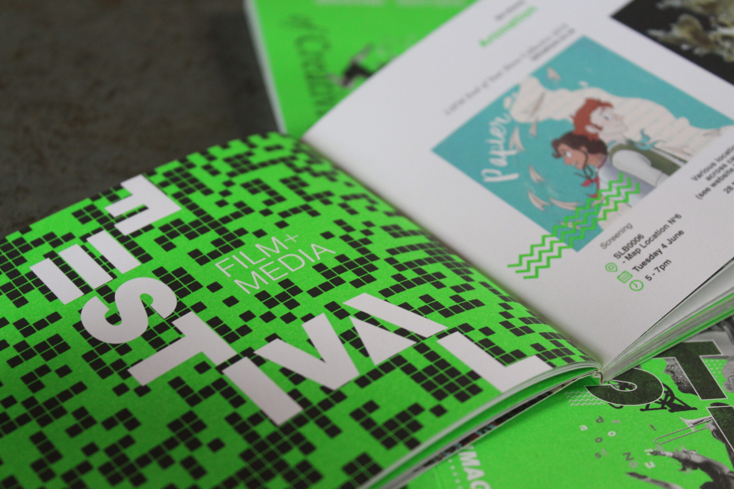
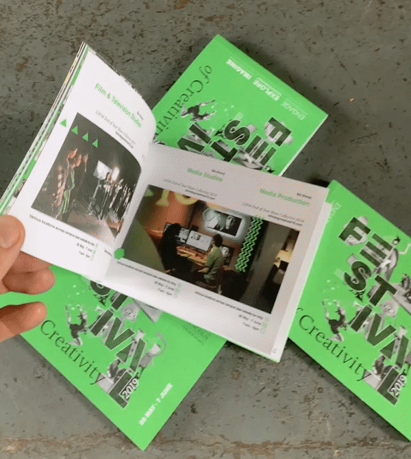
Print
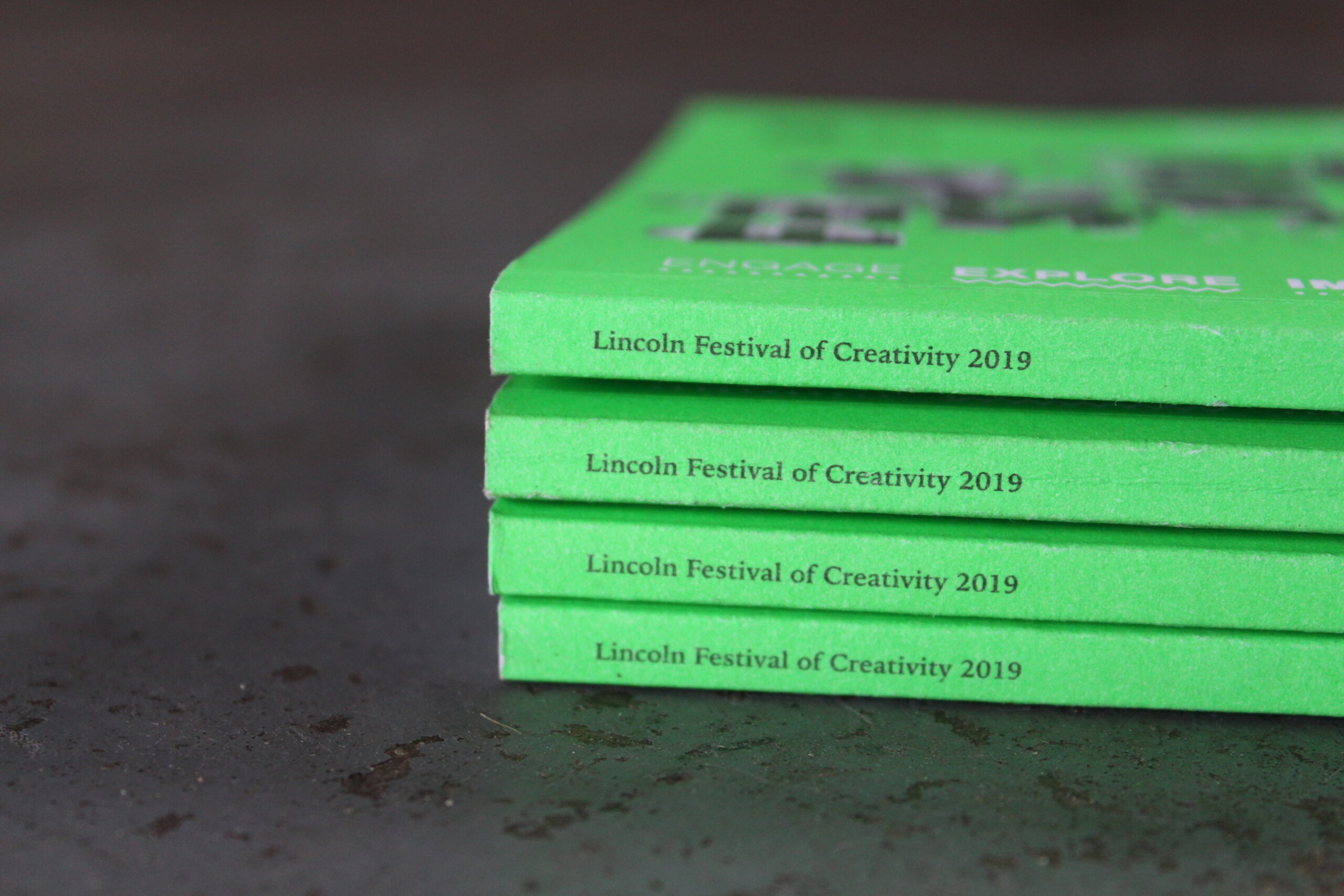
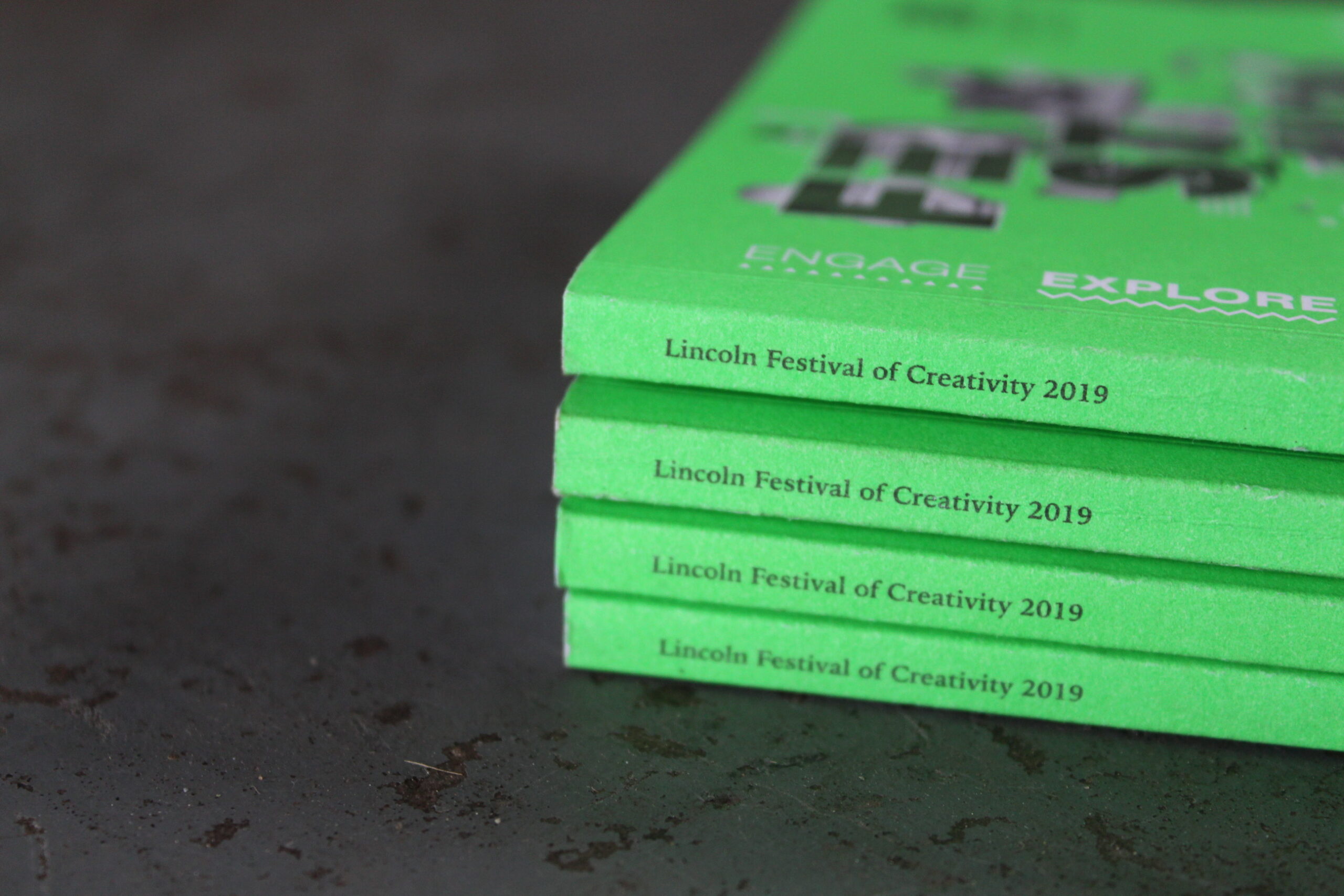
Print that pops
We wanted the neon colours to look just as good in person, as they did on screen. Therefore we chose special neon inks when printing the brochures and posters. This created a consistent eye catching colour across all digital and printed material.
•
Web
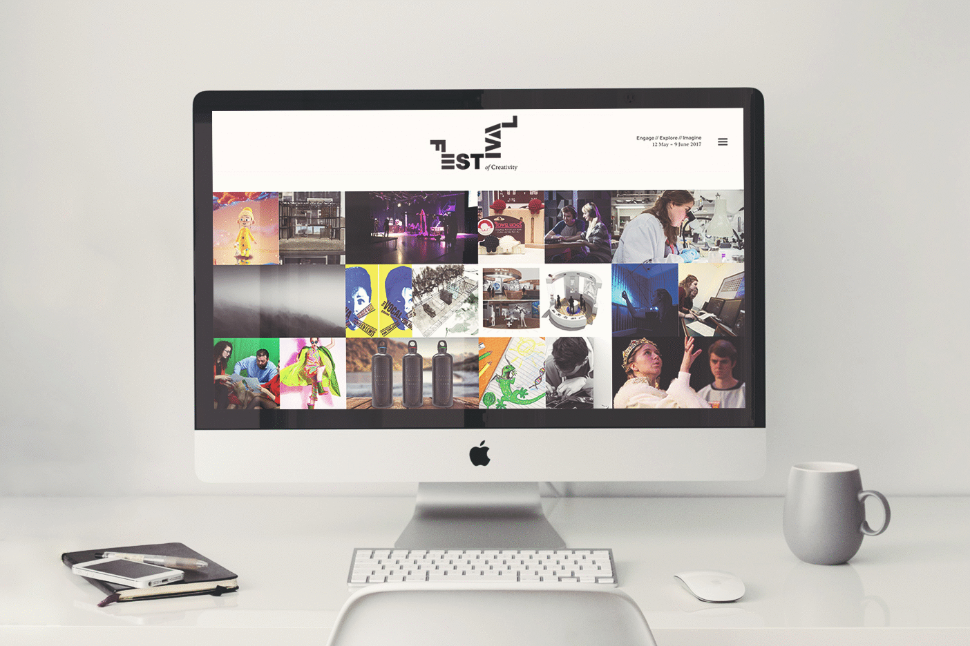
Website refresh
We refreshed the website to tie it in with the matching collateral, including the new colour palette, agenda changes and speakers. We also animated the identity to create a fourth dimension to the brand and add to the creative nature.
 cookie!