Not with robots,
with real people!
Want a chat about a job? Pick our brains? Or just have a beer coffee with the team?

Chestnut Homes
When Chestnut Homes, a renowned homebuilder in Lincolnshire, sought a fresh, cohesive style for their marketing materials, we stepped in to bring their vision to life.
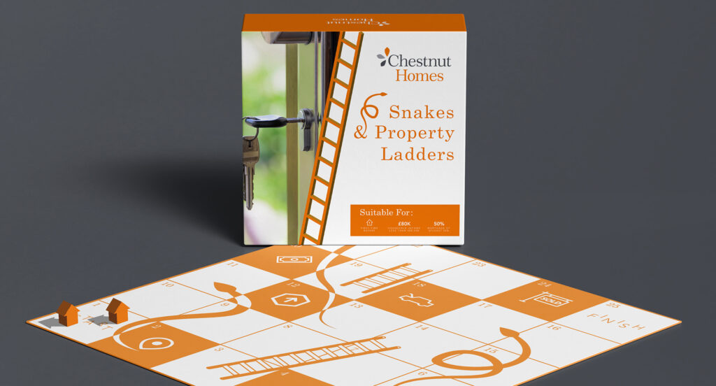
Armed with creative passion and a deep commitment to their brand values, we devised a unique design strategy centered around their existing identity. By leveraging bespoke visuals, adaptable elements, and tailored messaging, we not only elevated Chestnut Homes’ marketing presence but also enhanced their connection with each target demographic.
A Visual Anchor
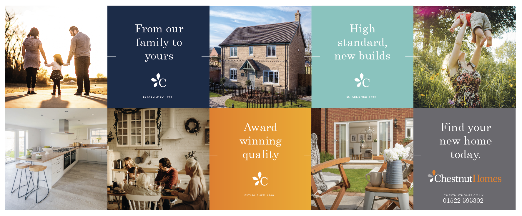
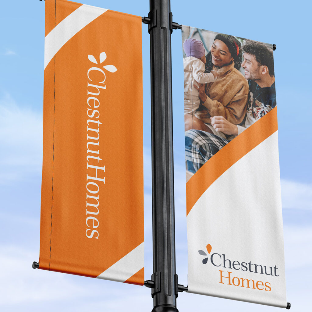
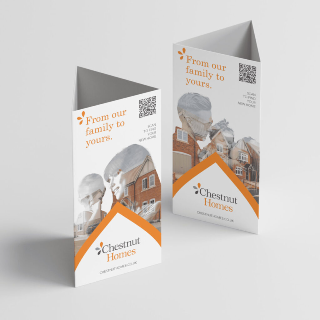
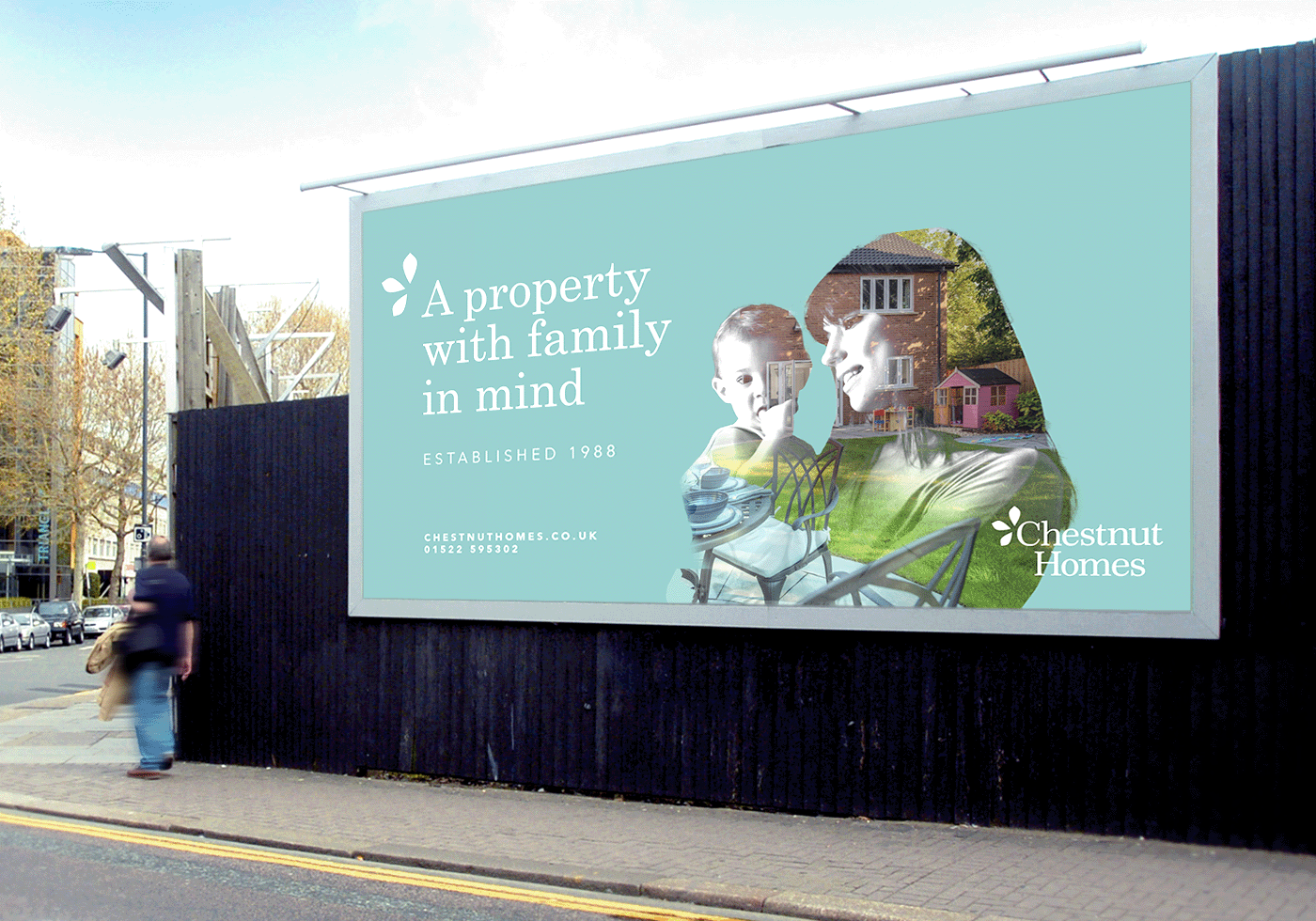
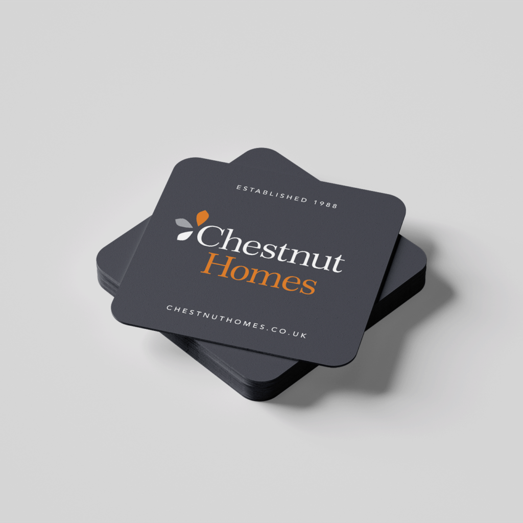
Armed with an intimate understanding of Chestnut Homes’ ethos, we set out to craft a design that was as bespoke as their builds. Innovation was the name of the game, starting with bold ideas and high-level concepts. At the heart of this transformation was the clever use of the ‘C’ in Chestnut’s identity. By isolating this element, we developed a creative design style that would unify all marketing materials. The ‘C’ wasn’t just a letter—it became a symbol, a visual anchor that makes every collateral undeniably Chestnut Homes, from brochures to billboards.
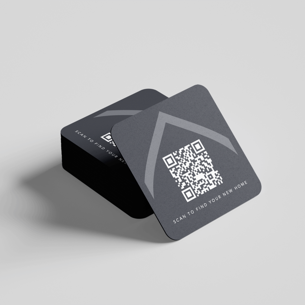
Taking things further, we extracted the iconic Chestnut Homes petal and transformed it into a versatile design element. This wasn’t just a lovely aesthetic flourish—it represented more. The unique cross-section resembled the roof of a home, tying it directly to their industry. It also functioned as a wayfinding tool, guiding the viewer’s attention across designs in an intuitive, thoughtful manner.



Animating Complex Concepts
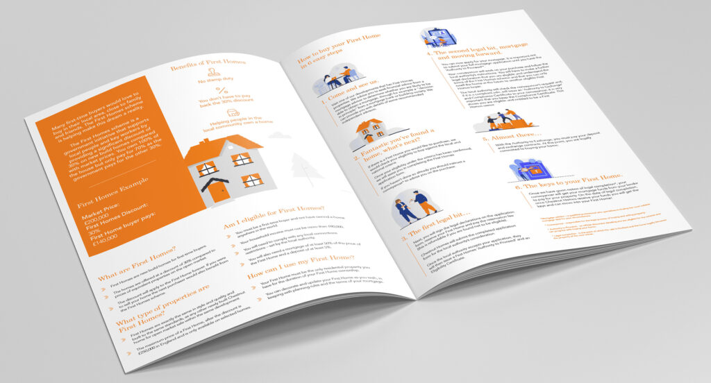
Various motion graphics were used across social platforms to help advertise Chestnut Homes. They say a picture paints a thousand words, well an animation paints a million.The reach and interaction on said animation were very well received.
For the ‘First Homes’ scheme we created an explainer video to help demonstrate the ins and outs of what can sometimes be quite a daunting process. The video was very well received and their client base, saying you have taken a complex subject and broken it down into an easy to digest, bitesize animation.
A Boxing Day Campaign
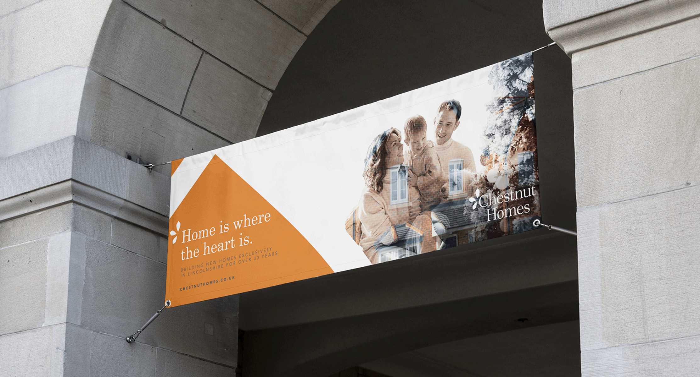
We were asked to create assets for Chestnut Homes race day promotion. They needed to follow the current guidelines we had created for them but show their homely look and feel. This year’s message, ‘Home is where the heart is’, was at the forefront of the campaign.
Therefore the correct imagery had to be chosen wisely to reflect the message. We continued to use the dual exposure as this is something we previously created as part as their brand toolkit.

We have worked with Shaun, Ben and the team on a number of different projects now, which have all been very successful. They are such a creative team, who think outside the box and really take time to understand the brief. They are fantastic people who are a pleasure to work with. We would highly recommend Born Agency.
Olivia Stephenson
Marketing Manager
Want a chat about a job? Pick our brains? Or just have a beer coffee with the team?
Fancy a chat?
hello@bornagency.co.uk
01522 612676
Middletons Yard
7 Potter St
Worksop
S80 2FT
Directions