Not with robots,
with real people!
Want a chat about a job? Pick our brains? Or just have a beer coffee with the team?

Okay, so let’s kick off by saying a logo will need something monumental to become irrelevant within branding. It has been a long developing trend that brands are more than just a logo. Entire branding projects no longer focus on new fresh logos, but rather the other elements that make a well-designed and hard working brand. Look at Lufthansa earlier this year that changed almost everything about their brand, but the logo.
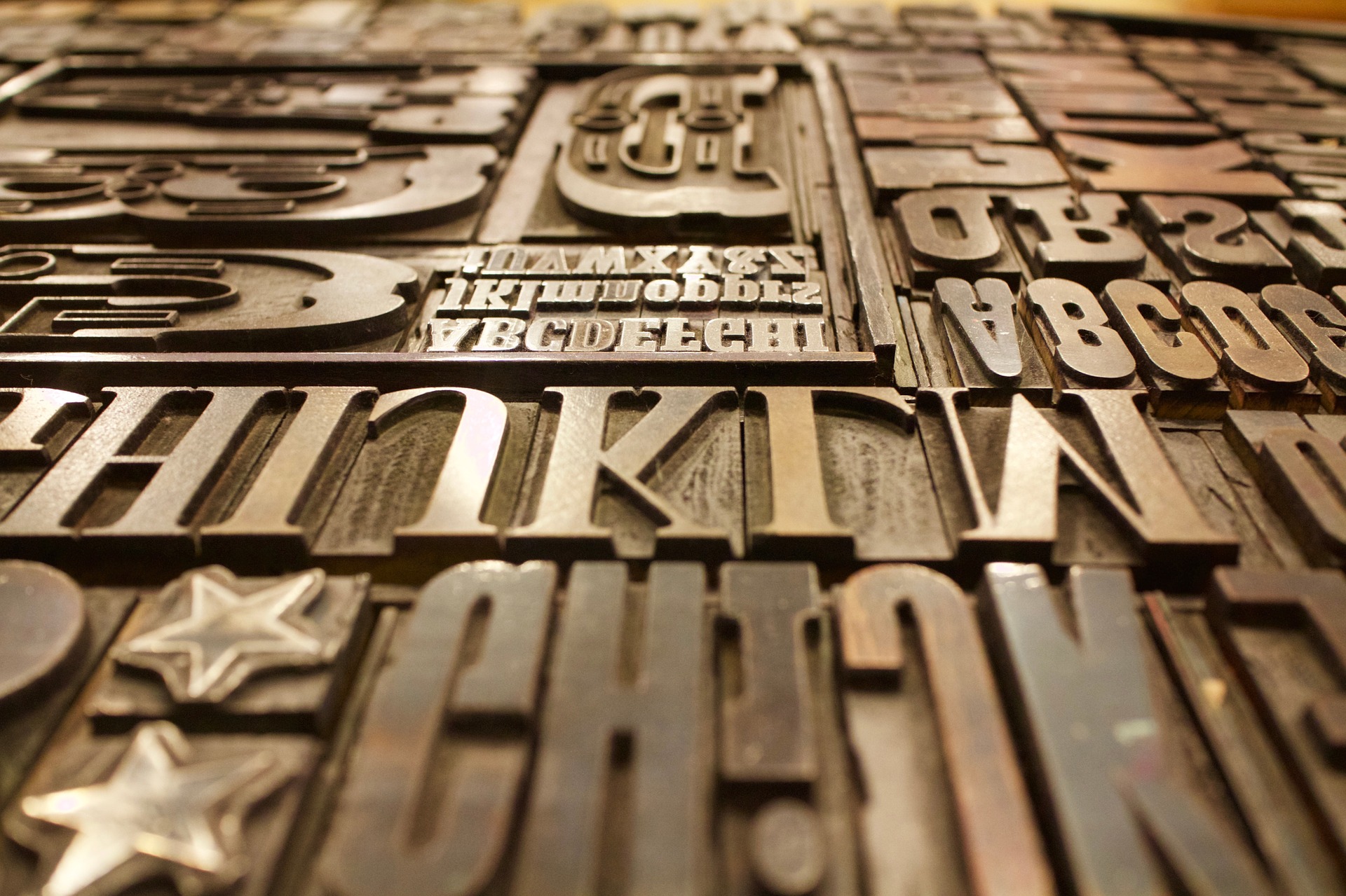
So one of these elements is the choice of fonts and typefaces for a brand. How a brand looks typographically has become essential in recent years. We absorb information quicker and in shorter form through various digital and non-digital ways. How a message is presented is as important as the message itself.
Some brands are now seeing the value of this. Especially as we move firmly into an expanding digital world. Having fonts which look ‘on brand’ and just as easy to read on devices is key. That’s why we’ve seen an expansion of brands with their very own fonts. Fonts created bespoke for that individual brand.
This week we’ve seen Netflix unveil Netflix Sans, a new font designed by Netflix’s in-house team and Dalton Maag. This article from It’s Nice That, talks about how a simple font was designed with clever hints and callbacks to Netflix’s visual identity. Most of Netflix’s services are provided away from their logo. In fact the frustration of the logo on the loading screen hinders, as users are keen to get scrolling trough the 1000’s of hours of content on Netflix to binge. (I’d recommend Stranger Things!) But during all that scrolling users will soon be reading titles and information via Netflix Sans, making what users are absorbing more on-brand.
Netflix is one of many brands to adopt their own brand fonts. Coca-Cola, Tesco and even the countries of Wales and Sweden have their own fonts. The BBC last year introduced BBC Reith, ditching the decades old BBC love affair with Gill Sans. This headline from the BBC GEL blog post sums up why fonts are so important with brands ‘Introducing Reith – the new face of the BBC’.
Netflix and the other brands mentioned are not the first brands to create custom fonts. Even before the invention of computers The Times in 1931 commissioned a pioneering typographer Stanley Morison to create a font after he criticised how the papers pervious typography styles made it hard to read and print. In 1932 Times was introduced and proved perfect as it made the large sized newspapers easier to read before the time of visual news. Today Times, and the Microsoft inspired version Times New Roman is used across the world from letters to school reports. Maybe one day we’ll be sending invoices in Netflix Sans?
Of course brands still need a strong logo, colour and guidelines to keep them a hard-working brand. Coca-Cola’s font TCCC Unity will never replace the bold red and iconic bottle design associated with Coca-Cola’s brand. However, we’re seeing an exciting trend amongst brands to see how typography works within their brand.
If you’re interested in reading more about the world of fonts and type we’d recommend Just My Type by Simon Garfield, an excellent read for both designers and those who love just looking at the exciting craft of typography.
And if your brand could do some TLC in the type area, see how we can help. Talk to one of our friendly team today.
Want a chat about a job? Pick our brains? Or just have a beer coffee with the team?
Fancy a chat?
hello@bornagency.co.uk
01522 612676
Middletons Yard
7 Potter St
Worksop
S80 2FT
Directions